

Table of Contents
Website Usability Benefits

According to a global Adobe study, given 15 minutes, over 59% of users will read and browse through an aesthetically pleasing website rather than something plain and boring. Another study reveals that 73.1% and 88.5% of respondents revealed that visitors lose interest in their business due to unresponsive and slow sites, respectively.
This clearly signifies that website usability matters to users a lot. It encourages them to engage with your website for longer (reduced bounce rate), which gives them a sense of satisfaction. With heightened customer satisfaction, businesses can achieve enhanced customer retention and have a better chance for conversions eventually.
In simple terms, website usability benefits include driving more customers while improving user engagement and retention. This, in turn, can help you achieve sustainable business growth.
But what makes a website user-friendly? Is it just the design and attractiveness or the loading speed?
Well, read the blog to learn seven powerful strategies that will help you create a user-friendly and profitable business website.
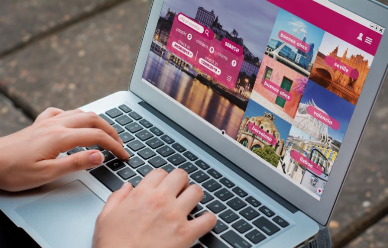
Mobile responsiveness

You may be reading this blog on your mobile or tab. At present, there are over 6.92 billion mobile users worldwide. With increased mobile traffic, how users and search engines interact with websites has also changed.
Today, over 54% of web traffic comes from mobile, which indicates that a large part of global users rely on their smartphones for searching information on their mobiles. So, if you don’t have a mobile-responsive website, you are missing out on a significant number of customers.
Mobile responsiveness is the highest impacting ranking factor. With Google’s mobile-first indexing algorithm, Google bots tend to crawl only the mobile version of your website. This means to rank your website in the top search rankings, you should highly prioritise optimising your website for mobile.
Optimisation means designing your website in a way that it fits all screen sizes. Further, it should load quickly and can be easily navigable across all devices, including smartphones, tablets, desktops, etc.
Now that you know the mobile responsive web design advantages, below are some simple techniques to make your website mobile-friendly.
- Upgrade your website into a mobile-friendly experience to ensure it adapts flawlessly to different screen sizes and orientations. For this, you could either install a dedicated mobile-first plugin or hand-code a responsive website.
- Make your content easily readable on any screen size: use large, readable text and shorter paragraphs, concise and eye-catching headlines and subheadlines, and make interactive elements like checkboxes and buttons.
- Minimise the site’s load time on mobile by compressing the images, reducing code, enabling browser caching, and merging elements wherever possible.
- Condense menus and navigation options into a mobile-friendly menu.
- Use image formats offering a balance between size and quality. Implement lazy loading to specifically load images when they become visible in the viewport.
- Avoid using promotional, advertisements and other pop-ups whenever possible.
- Consider implementing accelerated mobile pages (AMP) for specific pages.
- Ensure maintaining a consistent look and feel on your mobile screen, providing a unified brand experience as that of the desktop version.
When arriving on a website, visitors often look for the navigation bar to familiarise themselves with the page. Intuitive navigation enhances the user experience on your website by simplifying their interaction and guiding them throughout their journey on your site.
Clear and well-organised elements guide users effortlessly, reducing confusion and frustration. This lets users access the desired content quickly, promoting engagement and satisfaction.
Here is what you can do to organise menu and content and improve website navigation:
- Make your navigation clutter-free by limiting the number of items/categories in the navigation bar. Use a drop-down menu with many sections and pages if you have a large site.
- Arrange menu items based on their relevance and importance by prioritising hierarchy.
- Use easily understandable and descriptive labels for menu items. Avoid using jargon or complex words that might confuse the users.
- Place the search bar prominently to help users quickly find specific content.
- Group related content or services under appropriate categories to streamline navigation.
Page loading speed

Nothing annoys your users more than a website that takes a long to load. In fact, 50% of users expect your site to load within two seconds and will leave if it doesn’t load within 3 seconds.
Website speed is also important to hold the users’ attention on your site longer. This allows them to decide if they want to engage with your business. Further, a faster loading speed is also a crucial search ranking factor.
There are some free tools to test the speed of your website, such as Google’s Page Speed Insights, and Pingdom. Once you determine your site’s existing speed, here’s what you can do to improve it:
- Optimise images by reducing their file size by adjusting their width and height, save them in the right format, and compress them.
- Use browser caching by finding the domain’s .htaccess file and setting the expiration times for your page elements.
- Enable GZIP compression to reduce file sizes.
- Optimise the code on your site by trimming. Make sure you don’t break the code.
Clear CTAs

Compelling CTAs are vital for conversions as they guide users toward desired actions, which transforms their interest into engagement. Clear and well-crafted CTAs encourage motivation and urgency, driving users to sign, explore more, or purchase.
A few quick tips for creating effective CTAs are:
- Keep it simple.
- Create a sense of urgency.
- Use action words.
- Be creative.
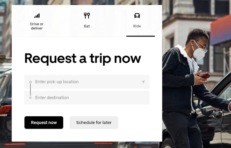
An example of a great CTA is that of Uber. Using the CTAs, it looks for two different types of people to sign up on their site: drivers and riders. Although both user personas have distinct objectives, the website effectively unites them through a prominent backdrop.
Streamline forms

User-friendly, intuitive forms play a crucial role in capturing leads by reducing friction and improving the user experience during the conversion process. Well-structured and visually appealing forms encourage more visitors to willingly provide their information.
Here are some tips to create conscious and intuitive forms:
- Use correct labels for all fields
- Keep the number of fields to a minimum
- Follow good form design principles
- Display on-screen message on completion
- Offer tooltips and suggestions
- Ensure mobile-friendliness when creating forms.
Ultimately, uncomplicated and easy-to-use forms allow businesses to collect valuable leads efficiently. This, in turn, increases their conversion rates and improves data accuracy and overall customer satisfaction.
Engaging visuals

Visuals help you offer a more significant first impression of your brand at a glance than text. Attractive colours, engaging characters and unique backdrops help captivate user attention while giving clear messages interactively.
Sources show that 93% of online buyers consider the visual appearance of products a major purchasing factor. Moreover, Shopify reported a 31% increase in conversion rates with superior-quality images and multiple angles.
Impeccable visuals also evoke emotional responses, promoting a deeper connection between users and the brand message. Users are able to associate more with visuals with the overall quality of the service or product, which gives them the confidence to make a purchase.
Here are some tips from the top web designing company in Melbourne for choosing the right visuals for your business website:
- Ensure that the visuals you choose directly relate to your site’s content and message.
- Select high-resolution images that are crisp and clear instead of blurry or pixelated visuals.
- Maintain a consistent visual appeal throughout the website, including image types, colour schemes, and design elements.
- Only use authentic and original images to stand out and connect with the audience better.
- Opt for visuals that evoke emotions relevant to your content. This will make visiting your website a memorable experience for the visitors.
- Consider the file sizes of images to avoid slowing down the site’s loading speed.
Accessibility

As per International Web Standards, web accessibility ensures that website technologies and tools are accessible to people with disabilities – auditory, cognitive, visual, neurological, physical and speech.
With this, we mean that all users should be able to access and use your website, irrespective of their abilities or disabilities. This way, users are held back from having a great user experience due to permanent or temporary setbacks.
Such inclusive websites foster an environment of diversity, enabling everyone to engage with content, information and services.
To create an inclusive website, businesses should consider the following factors:
- Disabilities affecting speech or thoughts.
- Impairments related to touch, sight, or hearing.
- Demographic limitations
- Internet connectivity, technical and hardware constraints.
